|
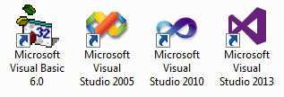 I just installed Microsoft Visual Studio 2013. Man, is it ugly. I just installed Microsoft Visual Studio 2013. Man, is it ugly.
Beauty is in the eye of the beholder,
but we can all agree on ugly
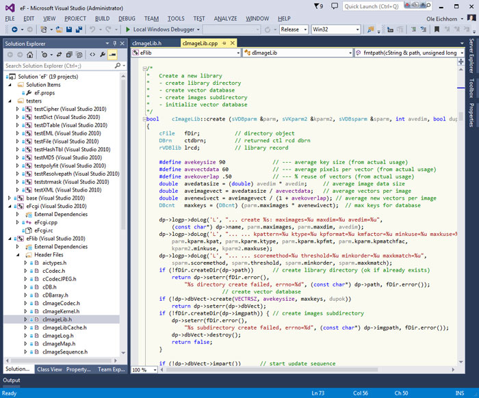
This "flat" trend in computer user interfaces where we have primary colors, no shading, no affordances, no visual features of any kind has to have bottomed out now, right? Hopefully the pendulum will swing back and we can have pretty user interfaces that are easier to use again.
I have been messing around with Bitcoin, as you know, and decided it would be "fun" to build a full Bitcoin node from scratch. The latest version for Windows, as checked into Github, uses VS2013, so I figured why not install it. (My everyday version of Visual Studio is 2010.) So I did. And so I hate the way it looks.
Here's VS 2013, in all its flat glory:
For comparison, here's Visual Studio 2010, open on the same project:
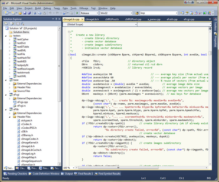
See what I mean? There is shading, the buttons look like buttons, the scrollbars look like sliders, etc. VS2010 was not only better looking, but easier to use. For further comparison, here's my previous go-to version, good old VS2005:
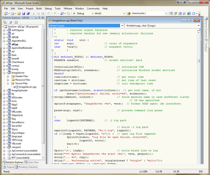
I will say that VS2008 was an improvement over VS2005, but only by a little. (I did like the window interface of VS2005 better than the tabbed interface of VS2008, but that's another story.) And going even further back, here's Visual Basic 6, part of the version of Visual Studio which was released in 2000:
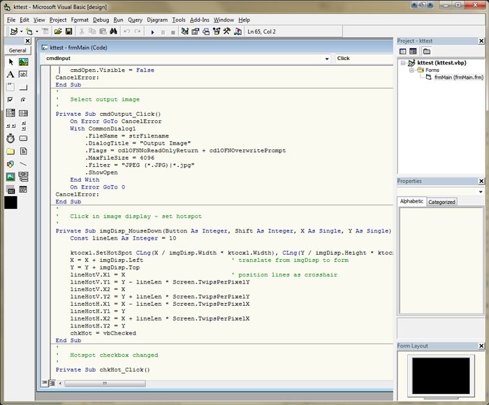
Yep, that fifteen-year-old user interface is better looking than VS2013. Blech.
Even the VS2013 icon is ugly! Check out the icon evolution at the top of this post. I'm surprised they didn't just use a purple rectangle, but maybe that will come in VS2015.
| 


