|
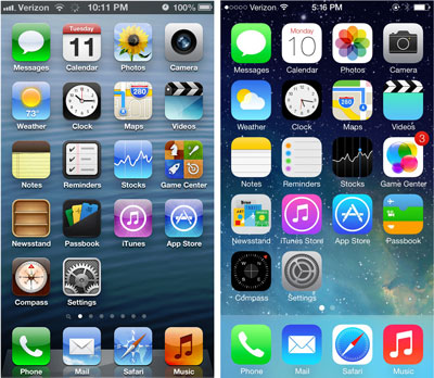
I'm not one of those who think that just because Steve Jobs passed away, Apple will stop innovating or taking care of their customers. But I have to say, IOS 7 sucks. Yes, it is buggy, and yes, that bothers me, and yes, Apple will eventually fix the bugs. But what I really don't like is that the overall usability is worse than IOS 6. In fact, it's worse than IOS 5, too.
 I have a late-model iPad 3 which is now running IOS 7. I also have an original iPad which is permanently stuck on IOS 5.1, the last version which supports that hardware. I keep the iPad 1 in my TV-watching area; it's great for reading or sending a quick message, and especially great for Googling something while watching sports. And every time I pick up the iPad 1 - every time - I can't believe how much nicer IOS 5 looks than IOS 7, and how much easier it is to use. I was hoping this feeling would wear off as I became used to IOS 7, but instead it has just become stronger. I have a late-model iPad 3 which is now running IOS 7. I also have an original iPad which is permanently stuck on IOS 5.1, the last version which supports that hardware. I keep the iPad 1 in my TV-watching area; it's great for reading or sending a quick message, and especially great for Googling something while watching sports. And every time I pick up the iPad 1 - every time - I can't believe how much nicer IOS 5 looks than IOS 7, and how much easier it is to use. I was hoping this feeling would wear off as I became used to IOS 7, but instead it has just become stronger.
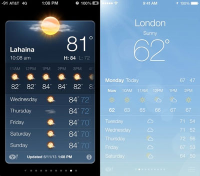
So why is IOS 7 worse? Well first, all those anthromorphic "affordances" which had become part of computer user interfaces are rather nice. The 3D effects, the buttons that look like things you push and sliders that look like things that slide, and raised edges to delimit things, and fake drop shadows to set things apart from each other. I'm all for simple, but all of those effects actually look nice, and make it easier to figure out what's going on. With IOS 7 you can't tell buttons from text from sliders.
May I say, I strongly dislike the "flat" look of recent Windows and Office releases too. But why did Apple have to follow Microsoft down this bad road?
Next, the fancy double-click-home to switch Apps is all very exciting, but in the end it takes longer to switch Apps. I was a big fan of Palm's WebOS and when I first saw IOS 7's new "task switcher" I thought wow, cool. But the truth is that when you're switching Apps, you just want to switch, and you don't need to see a preview. The old way of double-clicking and then selecting the App icon was faster.
[ Update: I've emailed with a few of you about this; upon consideration the difference between WebOS and IOS 7 is the double-click. That's it. Under WebOS you clicked the home button once to turn running Apps into "cards" and then you could swipe among them, and you double-clicked to go "home". IOS 7 reverses this. And that's just enough to make IOS 7 crummy for task switching. This shows how sensitive some of this UX stuff ends up being... Thanks for all the feedback and please keep it coming. ]
And how about searching for stuff? In IOS 5 you swiped left, typed what you wanted to find, and poof there it was, whether it was email or a website or a contact or whatever. Now with IOS 7 you swipe down, and type what you want to find, and ... sometimes you can find it. But not always. Was better when everything was searchable together.
Notifications ... well, I still haven't figured out what is where. What's the difference between a new notification and a missed one? Why do we need three categories. Maybe some people like the fine-grained control Apple added, but to me it just makes something that should be simple more complicated.
Control Center ... okay, it's easier to launch the flashlight. I have no problem with this, a nice improvement. Oh, and I would most definitely put automatic App updating in the win column. We could have that with the old look and feel too.
The new lock screen, meh. I liked the slider. The big advance was swiping up for a camera, but we had that with IOS 6. And speaking of the camera, not better. Flatter and uglier, harder to use, not an advance at all.
And the old keyboard is just ... nicer than the new one. I mean, it looked more like a keyboard, not just an array of little rectangles. They work the same, but I still liked the old one better.
 And finally, can I just say ... IOS 7 is ugly. I'm sorry but those simplified primary color icons just are. We have this amazing retina screen now and yet the icons look like they were designed for the original IBM PC. And finally, can I just say ... IOS 7 is ugly. I'm sorry but those simplified primary color icons just are. We have this amazing retina screen now and yet the icons look like they were designed for the original IBM PC.
So where do we go from here? Well, we're all locked in, we have to go along with Apple's upgrades. Let's hope they figure this out and IOS 8 goes back to the future.
| 


