|

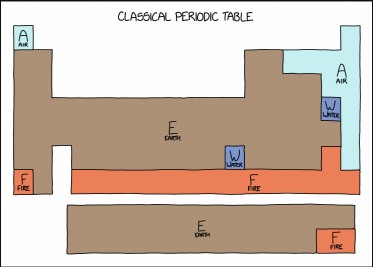
From xkcd, of course. Hehe.
As usual Randall hit a nail on the head, and he comes at it in a way which makes a point... yes, this is a useful periodic table, but no, a little too dumb and not that useful.
This is how I feel about the current trend toward "simple" user interfaces. They're dumbed down past the point of usefulness. The other day I tried Microsoft's "new Outlook", and it's a joke; you can't find anything because all the controls are hidden. Can we go back to good UI design now?
Anyway...
| 


