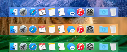
the new dock ... whacked with an ugly stickLast weekend I installed Yosemite, aka OS X 10.10, and I've been using it off and on during the week. Blech.
I am so tired of this overdesign Bauhaus less-is-more ugly minimalism. First Windows Phone, then Windows 8, then IOS 8, and now OS X too. I can't escape it but boy I wish I could. (I've actually turned on Accessibility on my phone so the buttons look like buttons again - although they are ugly buttons.)
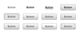
Ironically this trend has occurred just as hardware makes incredibly detailed shadings and effects practical. What's wrong with affordances? Why can't buttons look like buttons, and "click" like buttons? Why can't sliders slide, and folders open, and trash cans get full? Those are good things in a UI, not mere complexity, and taking them away reduces usability.

the evolution of buttons (in reverse)I like some of the functionality of Yosemite - like the integration with iCloud, and the improvements to Spotlight - but the bland crayola look-and-feel predominates my reaction to it. For all the gory details, please read John Siracusa's impeccably detailed review in Ars Technica. Weird that Apple chose "Yosemite" as the code name for this release; I can't imagine anything more beautiful than the National Park, more complexly beautiful, and yet this OS is the opposite of that, and they must have known it. In fact, we know they knew it, because they did this weird "vibrancy" thing where colors from underlying windows bleed through into the front window. There's no functional advantage to that, it was purely an attempt to make things prettier, a rather desperate attempt at that.

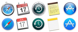
icons, old and new, which are prettier?One interesting part of John's article was a detailed discussion of Swift, Apple's new programming language,and the underlying SIL (Swift Intermediate Language). As I expected it isn't as fast or cool as we thought, and developers haven't flocked to it in droves. The incompatibility with other platforms is definitely going to hold it back. One of the under-appreciated reasons that Android has taken off is that there are so many Java programmers around who easily became Android programmers. Even Objective C was a little "off" from C++ and C#, and Swift is a step in the wrong direction. You can remind me I said this, but I expect most IOS and OS X developers to stick to Objective C for a long time.

why not just use a colored rectangle?Well onward. The world doesn't stand still, but I don't have to like this change. I wish there would be a new OS version which was actually more beautiful than the one that preceded it. Surely this pendulum will swing back?
| 


