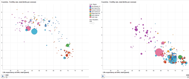
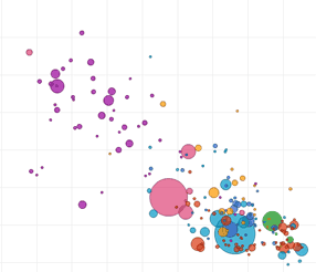
This is pretty amazing - an interactive graph of fertility vs life expectancy for different countries.
 
On the left is 1960, and on the right, 2008. The X axis is life expectancy, and the Y axis is fertility. Each ball represents a country, the diameter is proportional to the population. The pink ball is India and the blue ball is China, the green ball is the United States. You can see the precipitous decline in China's birthrate caused by their "one child" law.
[Update: if you click through, you may notice the colors are different; seem to be chosen at random?]
Now we just have to add measured IQ, and you can get scared by Unnatural Section.
© 2003--2026 Ole Eichhorn
| 


