<innovation optional=entirely>
While staying at the Sheraton in downtown New Orleans, attending and presenting at a conference, I noted an interesting innovation with their elevators. Elevators are an old established technology and you would think nothing new could be done to make them more efficient, but you would be wrong.
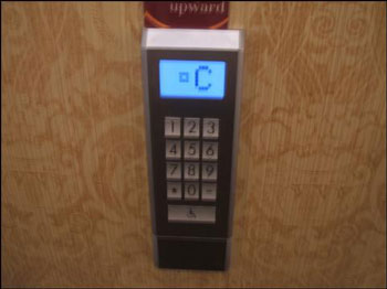 The hotel had five elevators transporting guests among twenty nine floors, including eight floors of conference space, restaurants, shops, etc. At each bank of elevators, instead of an UP and DOWN button there was a keypad. To call the elevator you enter your destination floor. The system immediately responds by telling you which elevator will arrive for you (they are lettered, e.g. after entering “5” the system responded with “C” as shown at right). When the elevator arrives you get in, and it takes you to your floor, you don’t push any buttons inside the elevator. The hotel had five elevators transporting guests among twenty nine floors, including eight floors of conference space, restaurants, shops, etc. At each bank of elevators, instead of an UP and DOWN button there was a keypad. To call the elevator you enter your destination floor. The system immediately responds by telling you which elevator will arrive for you (they are lettered, e.g. after entering “5” the system responded with “C” as shown at right). When the elevator arrives you get in, and it takes you to your floor, you don’t push any buttons inside the elevator.
This cool system has several advantages:
-
Telling the system your destination floor instead of just your destination direction gives it more information, so it can plan elevator travel more efficiently.
- Because the system tells you which elevator to use, you can go stand next to it, lessening the load time. Also the crowd at elevator banks is dispersed into orderly queues by each door.
- If a whole bunch of people need to go to the same floor(s), the system can assign them to multiple elevators on a first-come-first-serve basis. You never have an elevator which is too full.
- It is convenient not to have to push any buttons inside the elevator, particularly when they are crowded.
 As shown at left, the inside of the elevator doorway has a panel which shows the destination floor(s) for that elevator (in this case, “5”). This allows you to double-check that you’re getting on the right one. Note the letter identifying the elevator “pasted” over the old up/down lights. As shown at left, the inside of the elevator doorway has a panel which shows the destination floor(s) for that elevator (in this case, “5”). This allows you to double-check that you’re getting on the right one. Note the letter identifying the elevator “pasted” over the old up/down lights.
- Usability observation: using the letters A, B, C, D, and E to identify the elevators avoided confusion with numbered floors, but the auditory confirmation was confusing because B, C, D, and E sound so similar. Using something else like colors would have been better :)
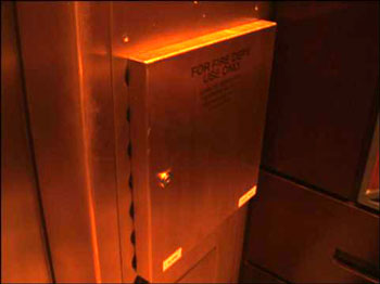 The picture at right shows the cover over the old destination buttons inside the elevator. Once you get in the elevator there are no buttons to push. If you change your mind about your destination you have to get out and punch your new choice into the keypad, at which point the system might not assign you the same elevator. The picture at right shows the cover over the old destination buttons inside the elevator. Once you get in the elevator there are no buttons to push. If you change your mind about your destination you have to get out and punch your new choice into the keypad, at which point the system might not assign you the same elevator.
- Usability observation: the keypads have big clicky buttons, easy to push and with positive physical feedback. Much better than a touchscreen.
Pretty cool, eh? Just when you think you've seen it all, you realize “it all” is so much more than you thought!
</innovation>
| 